
Walgreens
Project Harmony
Your new, self-service prescription refill dashboard.
Through a mobile-first, redesigned prescription refill dashboard, Walgreens customers now have the power of their prescriptions in their hands. Project Harmony accounts for all lifecycles in the prescription ordering process. With new features, customers now have increased flexibility when feeling their Rx and transparency into their order status—finally meeting their needs and expectations.
Released in 2021, this beta experience addresses years of customer pain points through new functionality and also includes a rebranded UI, now seen across digital and in-stores everywhere.
Overview
Problem Statement
How might we market Harmony’s many beneficial features to Walgreens pharmacy patients when each patient has different needs?
The Solution
A feature-driven approach targeted towards a wide-range of Walgreens personas and customer needs.

Process
Project Harmony’s backend capabilities were years in the making. While we already had user insights from past projects as to what functionality our customers wanted, Walgreens needed inventory and cross-pharmacy integration to enable self-service features. Due to this, Harmony’s process looked differently than a typical UX project. Product communicated what new features were added and personas. UX mapped and tailored features towards relevant audiences and leveraged previous customer insights for the design process.

Project Type
Desktop & mobile UI/UX design
Timeline
6 months to MVP
Role
Collaborated with UX and copywriter on high-fidelity wireframes designed within Sketch. Created prototypes for user research team to leverage in user testing via Adobe XD.
Team
UX partner, copywriters, user researchers, web development, product manager, business analyst, creative director, design systems.
Understanding pain points
After compiling research findings from previous projects and reviewing CSAT feedback, our team was able to identify pain point areas to leverage and solve for in our design solutions.

Lack of speed
The in-store and drive-thru pickup process is slow
Prescriptions are not ready when promised
The current pharmacy store locator is clunky
Lack of self-sufficiency
Features such as online chat, availability of medication guides and home delivery are favorited, but feel hard to navigate.

Lack of personalization
Most interested in features such as 90-day refills, other family member orders, and early refill requests, but find them difficult to understand.
User journeys & mobile-first designs

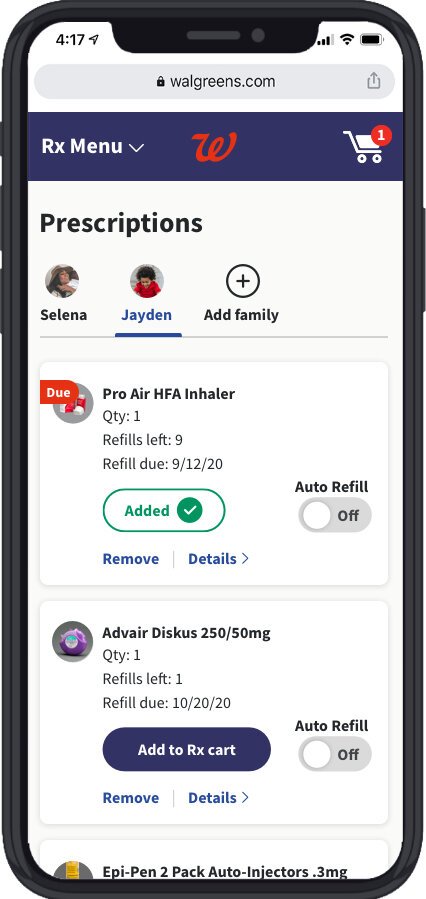
Selena’s journey
About
32-year-old business professional and mom to an active son, Jayden (3) with an on-the-go lifestyle.
Harmony features utilized
Transfer Rx via Store Locator
Express Pay
While at work, Selena gets a call from Jayden’s daycare letting her know that his asthma is acting up. Selena needs to get his inhaler filled immediately so that he can have a play-filled, relaxing night.
The story
The prescription refill journey
Selena requests a refill for the inhaler, but the order fulfillment gets delayed and can’t be picked up until tomorrow. Thankfully, the new Harmony features gives her options to remediate the delay. By using the store locator, Selena is able to see nearby pharmacies that will allow her to pickup today. Selena transfers Jayden’s Rx to a new pharmacy and opts in for an Express Pickup Drive-Thru Pass so that she doesn’t have to get out of the car with Jayden.

Designs & journey prototype
Selena’s journey (left to right)


Carl’s journey
About
58-year old Chicagoan recently widowed, suffering from pandemic anxiety.
Harmony features utilized
Switch to Home Delivery
Med Guide
Carl is recently widowed and like many others, learning to cope with the loneliness & grief that come with a global pandemic and the anxiety that comes with leaving the house and not feeling safe. While medication has never been something he is comfortable with, Carl sought help and has begun his treatment for anxiety under the care of his new psychiatrist.
The story
The prescription refill journey
After filling his prescription, Carl decides to explore more features on his prescription refill dashboard. He sees his “In Progress” order status at the top of the page, clicks to learn more, and notices that he can switch to Home Delivery. Carl now feels at ease knowing that he doesn’t have to go to the pharmacy in person in the height of Covid. Later, after Carl’s prescription has shipped to his house, he takes a look at the Med Guide feature on the order status details page. It gives him a sense of calm to be informed of all of the potential side effects of his new prescription.

Designs & journey prototype
Carl’s journey (left to right)


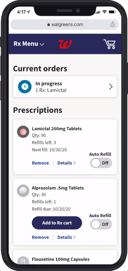


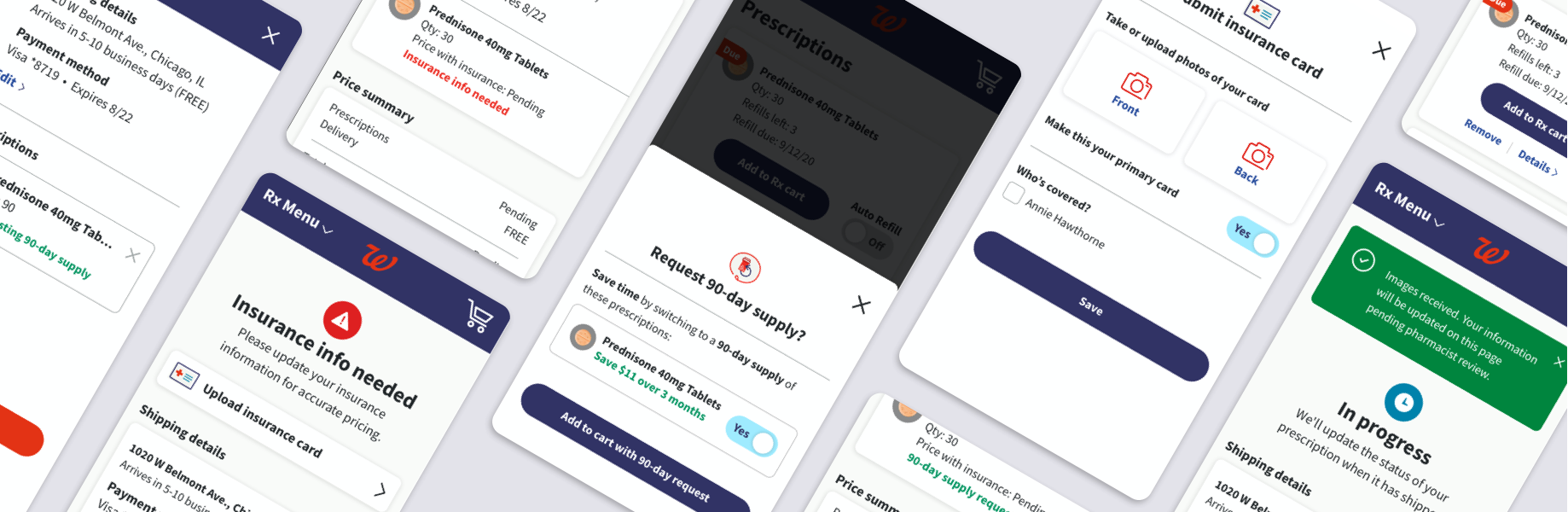
Annie’s journey
About
65-year-old recently retired school teacher recently enrolled in new insurance through Medicare Part D, on a tight budget.
Harmony features utilized
90-day refills
Insurance card upload
The story
Annie is a recently retired school teacher. Between her new daily routine & schedule and taking care of her husband (70), Annie often finds herself forgetting to refill her medications on time.
The prescription refill journey
Walgreens notices that Annie has been consistently filling her prescriptions late. When she navigates to her prescription dashboard and adds her prescription to cart, Annie receives a notification that she can save time by switching to a 90-day supply (versus her usual 30). Walgreens also calculates her savings and lets her know that she’ll save $11 over 3 months by switching to 90-day refills. This allows her to save money and finally stay on track with her meds.
Later that day, Walgreens texts Annie an alert to upload her new insurance card to ensure the pricing of her scripts is accurate. She takes a few quick photos, uploads them, and feels relieved to be on top of things.

Designs & journey prototype
Annie’s journey (left to right)


User testing feedback
All new prescription refill dashboard Harmony features and UI designs were tested in the Walgreens Research Lab with customers that fit the personas/audiences above.
Via moderated prototype testing led by our researchers, the UX team gained insights that led to the final iterations you’ve seen today.
Overall, the more modern visual UI designs and new self-service features were appreciated by customers and easily understood, but we found key insights to optimize our experience prior to the beta experience MVP that was soon to be launched to Walgreens employees.


Feedback by feature

Users were relieved to have a way to access urgent and delayed prescriptions more quickly by seeing them surfaced to the top of their dashboard.
The new Delayed order status was very important, but users didn’t always understand their options at a quick glance.
In Progress order status didn’t offer additional information other than confirmation page. Users didn’t always see value at a quick glance.
Rx Received order status gave customers a peace of mind, but risks misinterpretation.
New Prescription Order Statuses

The ability to change/transfer prescriptions to another pharmacy to get delayed prescriptions quicker was important, even if the other prescriptions in the order were already ready.
Interactions and animations when scrolling through store location cards could be a lot to take in within a small space.
New Store Locator Map

Changing pickup location was most valuable action.
Users want to add to existing orders, but may not think to go through status to do this.
Users appreciate the ability to finally be able to cancel an order online without calling the pharmacy.
New Edit Order Functionality
Users prefered to see 'pending' instead of cash prices on the order detail pages until the insurance had been approved.
Listing prescription prices as ‘Pending’ served no value.
New Insurance Card Upload
Next steps
The Harmony beta experience was delivered to the Walgreens web development team. As dev worked on making the MVP designs come to life, UX & UI continued to phase 2.
In our agile flow, we then focused on designing for complex edge case scenarios as well as the designs for secondary/supporting pharmacy pages. Our team also continued to evolve our design system as we found gaps between old and new branding and the app team’s designs.
