
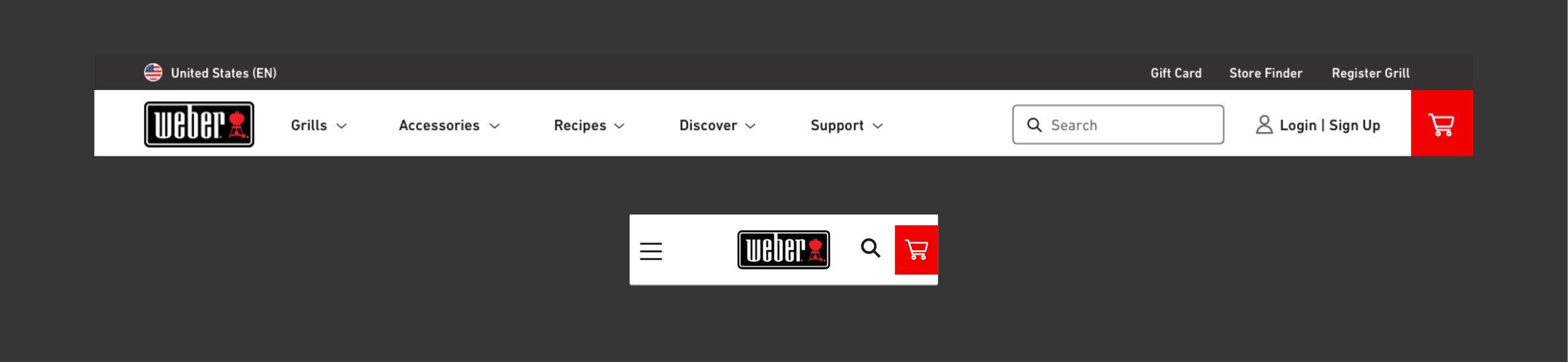
Weber Grills
Site Redesign & Salesforce CMS Re-platform
In the fall of 2021, I was tasked with the redesign of Weber.com: the world’s top selling gas and electric grills. As the lead designer, I worked in close collaboration with our team’s User Researcher and UX Designer to uncover user pain points, evaluate best practices via research, and redesign to create a more accessible, digestible DTC website.
As a hybrid UX & UI designer, I owned all things visual — from the UI/CMS libraries, interactions and page designs to heuristic analysis and client presentations.
Throughout the process, I worked closely in sprints with our agency’s web developers, project managers and our Weber Grill clients for a phased site launch approach.
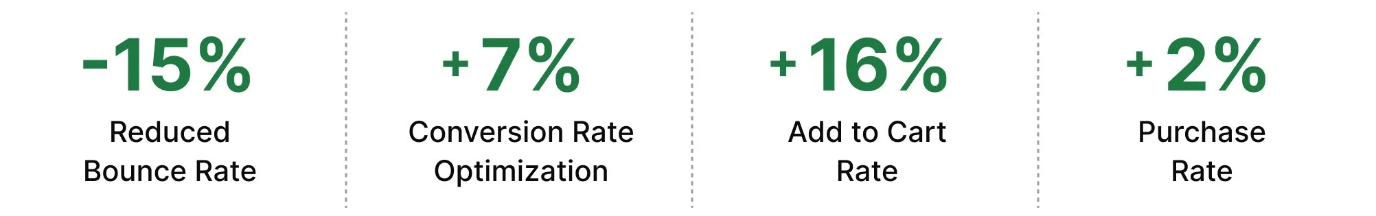
Why might Weber’s add to cart rate be high, yet purchase rates low?
Timeline
Mar 2021–May 2021
Tools Used
Sketch
Adobe XD
InVision
Jira
Salesforce SFRA
Role
Lead UI Designer
Collaborators
Larry Levine (Creative Director)
Amanda Jones (User Researcher)


The problem
Weber.com’s add to cart rates were high, yet purchase rates low due to the lack of e-com best practices & limited site functionality, including:
Low consideration of the full customer journey
Broken mobile experience
Inability to compare products
Spec & feature heavy, hard to understand content
Inconsistent brand identity without a UI or CMS library
ADA compliancy violations
The Solution
By finding opportunities to educate new grill buyers on the differences between a large spec-heavy product assortment, the site became easier for users to digest and compare. Through customer support and site value propositions, users gained buyer confidence to complete their purchase.
New Site Features:

Improved information architecture

Reduced friction within ATC/checkout flow

Optimized product variants & meta-fields

Post-purchase support pathways

Product compare CLP & PDP functionality

ADA compliant UI & brand consistent CMS
Post-Launch Results
With such a tight launch timeline, many new site features and non-native UI designs didn’t make it into the MVP website. Our team continued to work on these features—iterating on designs, collecting user feedback, and leveraging our new templates for Weber’s other global markets.

Discovery Phase
Areas of opportunity
Our goal was to fully understand problem areas to drive new solutions through the following methodologies:
Stakeholder interviews
Google Analytic metrics, in collaboration with our analytics team
User research of the old weber.com
Heuristic analysis via Nielsen Norman Group & Baymard Institute best practices
Competitive analysis

Weber.com Heuristic Analysis
User Insights
Feedback
Within the old weber.com, users reacted poorly to the site aesthetic, stating that it felt “old” and lacked personality.

Recommendations
Align with similar brands — Vibrant • Feature-focused • Tech-forward • Lifestyle imagery

Navigation
Weber’s nav made browsing complex for visitors, as it failed to find the right balance between primary & secondary actions and buried content on mobile.
Feedback

Burton’s clean, fixed navigation is not only ADA compliant but has clear visual hierarchy to primary actions + easy to access search.
Recommendations
In addition to the above, Burton’s 2 tiered navigation allows for a promotional feature and exposes search—a highly used element—on mobile.

Homepage
In user testing, several users commented that the hero was too large with unpleasing marketing-heavy content.
Feedback

On mobile, one user commented that the hero was a “waste of space” and found the mobile swiping capability not necessary.
Patagonia’s hero’s have on one primary offering & are short to give a visual indicator there is more to scroll.
Recommendations
On mobile, Patagonia’s CMS library is mobile-optimized and does not leverage an auto-play hero hero — best practice within UX and reduces page load time.

As a new DTC site, many users did not realize grills were shoppable due to the lack of category features.
Feedback
In user testing we found that the current category styling caused users to overlook it & the scope of products displayed felt narrow. One user exclaimed confusion over seeing only a few grills under each section: “There must be more than just 4 grills…”
Everlane gives clear visual representation of top-level categories directly below the hero.
Recommendations

By showing a range of categories, this helps users understand the full breadth of products and reduces the risk of drop off that comes with misinterpreting offerings and bouncing.
Other Areas of Homepage Opportunity
An opportunity for returning users to see fresh content based on items they have previously viewed.
• Add Personalization
• Add a Product Finder Quiz
Having a site wizard that is accessible from the homepage will immediately engage and assist in exploratory or less sure customer & can stand in for an in-person sales
• Create Experiential Branding

Through social, testimonials and brand highlights (value props), users will be able to differentiate Weber from other brands.
Product Detail Pages
In user testing, either users couldn’t find the info they needed at all, or they had trouble sorting through from a visual perspective.
Feedback

Most users felt an information overload with long-format content & found too many upsells off-putting / an interruption. With a long page scroll on mobile, users asked for some type of quick-link access.
For spec-heavy products, Dyson leverages a variety of visualizations that allow users to quickly scan.
Recommendations
Dyson also pays special attention to their mobile layout, determining what content gets nested/truncated and what information is deemed crucial enough to remain exposed.

Design Phase
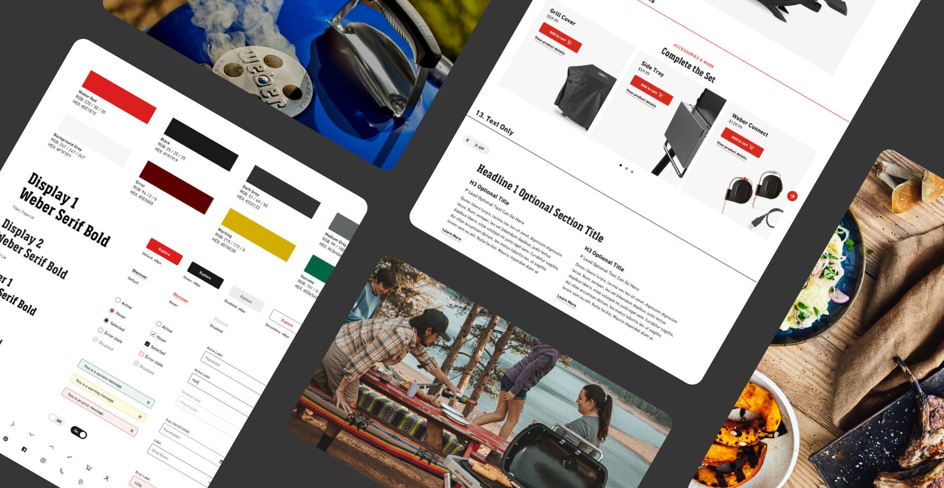
CMS design & UI library
Hierarchy & consistency solved through a new design system with a flexible, reusable set of stylized interface elements.
On the old weber.com, the site didn’t leverage a UI library. In turn, it lacked consistency in type styles and colors—all of which created a lack of hierarchy and no visual cues as to what the most important elements on the page were. Weber also did not have a CMS library. Due to this, the site didn’t leverage a grid system, lacked visual consistency and custom development work was in need any time new pages were needed.
By building UI library, the new site now had set typography, colors and button styles to choose from— all with rules to create consistency and to be tied to the CMS. Through a new CMS library, our client was no longer reliant on development and could easily build out new pages on their own in Salesforce. The ability of CMS modules allowed Weber to focus more the page content and less on the overwhelming aspect of design (for a group of non-designers).
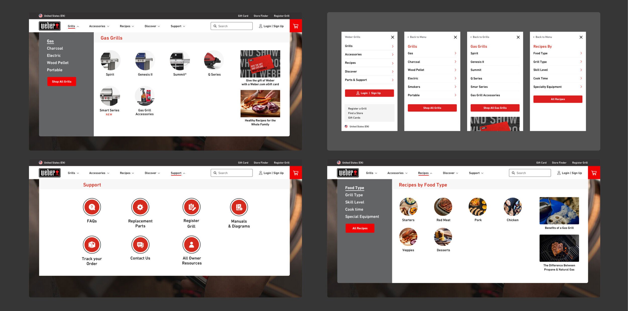
Main Navigation
New taxonomy and renamed main navigation links created a quick scan of Weber product offerings and access to popular/most clicked support links.
Smaller, less important actions were moved into a secondary courtesy navigation (grey bar) and allowed for more focus on search, account and cart in the primary nav—all key drivers of conversion. A new mega menu approach allows users to browse grill categories and see pictures of each grill type, ultimately allowing users to compare products. With a new right-hand rail, the Weber team has a placehold slot for promotions & featured content to keep the nav dynamic.
Homepage
A personalized shopping experience for all audiences
In this restructure, users now see the broad range of the products that the site offers, followed by a curated selection of CMS blocks, such as a product quiz, seasonal recipes, best sellers and support links for current grill owners. Our recommendation to the client was to keep the homepage short and allow for pathway modules in which users can click into and learn more if interested. A suggested template of content, hierarchy and art direction (shown below) was provided to the client to leverage but ultimately customize how they see fit via the CMS.

Category + Product Listing Page Template
Find your perfect grill with features you didn’t no you needed
In this revamp, the hero real estate is used valuably to showcase the sub-categories of grills within the main grill category to help users quickly compare between each. Below, our team introduced a robust filtering system and condensed each product variant into one product card. Additional CLP features include: Product compare, sales and promo tagging, image hover states on desktop, quick ATC, and feature image insets.

Product Detail Page
Impactful existing content revamped into a visually digestible experience
The new PDP is packed full of new features: A sticky add to cart + anchor jump link combo bar, “What’s In the Box” module, interactive grill comparison chart and dynamic add-on products. The most impactful change lives within the buy box. The new layout ensures that users have all key product details readily available on land and leaves content-heavy, detailed information below the fold in the features & specification section. With free shipping and return messaging, buyer confidence was increased.
From the previous site, we took buried text-based information and brought them to life through high-end, close up imagery and iconography. This page now serves as a scalable template for our client to easily hide and add modules as they see fit.

Cart & Checkout
Introducing a mini cart was crucial to adding convenience to the user’s shopping experience, as it allowed them to quickly access checkout and gain awareness to the key Weber value props of free shipping & returns. Through Salesforce, the full cart & checkout flow was optimized to include: An enclosed checkout experience, product upsells and 3rd party payment and financing options.

Post-Launch
In 2020, Weber.com won a Webby Award for it’s site redesign and has seen an increase in conversion. In 2023, Weber.com was recently featured on The Harrison Poll for it’s increase in sales towards the millennial target audience.
Harrison Pull Article Highlights
Using Harris Brand Platform data to compare the breakdown of Weber consumers in 2020 versus 2022, it's apparent that the brand sees significant growth in the percentage of Millennial (+10.8%) and Gen Z (+2.3%) users.
While the percentage of Weber’s Gen Z consumers almost doubled from 2020 to 2022, this group is still considerably smaller than Millennials. Older than Gen Z, more Millennials are purchasing homes, and the accompanying appliances for their “outdoor kitchens.” Weber should continue to see their percentage of Gen Z consumers grow as more reach the home-buying phase of life.
Millennials, fire up your (Weber) grills!

Weber Grill Sales Conversion Funnel 2022

Weber’s increase in younger consumers (both Gen Zers and Millennials) is clearly seen when the brand's Harris Brand Platform sales conversion funnel from 2020 is compared to their sales funnel from 2022.
The funnel is noticeably wider across each phase of the consumer journey in 2022, signaling that more Millennial and Gen Z consumers are learning about, trying, using, and recommending the Weber brand. The most significant increases are seen in the familiarity (+8.1) and trial (+9.6) phases of the process.